Oligarch Business Magazine
Oligarch is a fictional business magazine I designed to both practice my magazine design skills as well as lightheartedly satirize the 1%. Due to the way many wealthy people take themselves as seriously as mountains, I thought a black, white, and gray color scheme and brutalist aesthetic would convey an industrial, mechanical, and scientific air–as if the page were forged from steel and pressed from factory plates. A bit of a dreary design, but perfect for its ethos. I also took the opportunity to insert fictional corporations into the magazine as a fun Easter egg hunt and an homage to games I admire.

Sadie’s Starry Bakery Box
To practice my design skills, I decided to make a cupcake box inspired by my favorite red velvet cupcakes at a local 50s styled cupcake confectionery store. By the way, Sadie’s itself is not a real establishment, it is just a name I chose as a placeholder to practice my artistic skills. Anyways, I always thought there was always a harmony between sweets and child-like designs, so I painted a child’s street chalk conception of a Cupcake Planet with frosting and blue sprinkle mountains. The result was the homey, nostalgic vibe of a childhood memory that fits with the sweetness of confections and the essential nature of bread. I chose a cheerful, high contrast color palette to paint my intergalactic red velvet cupcake spinning with sparky orange stars in the blackness of outer space. Very chic, and cute enough for a bakery, if I say so myself.

Personal Business Card
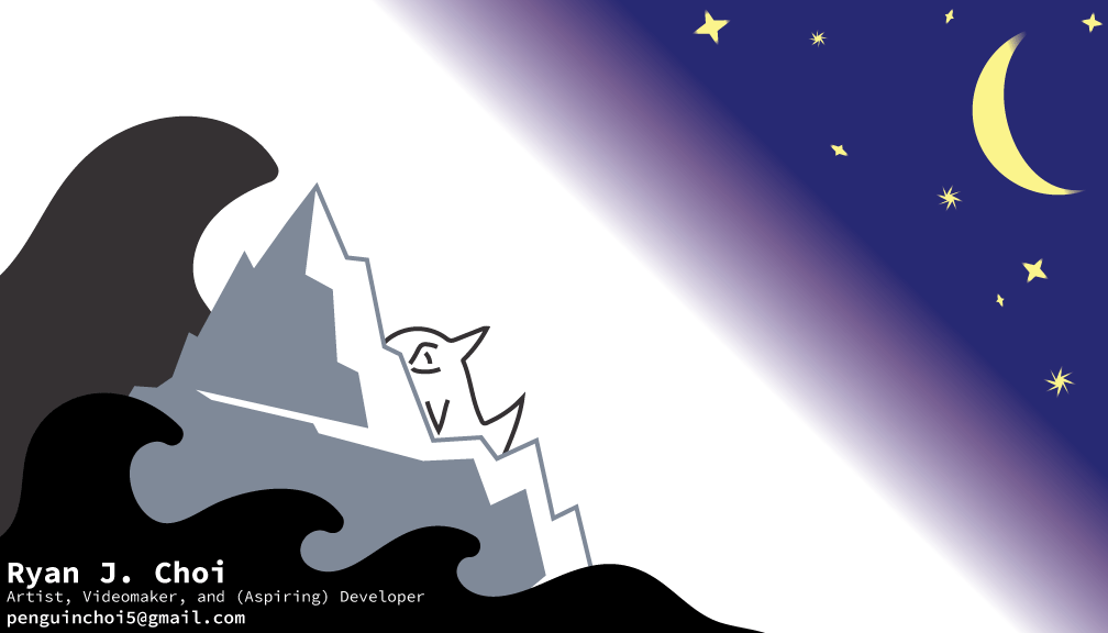
I wanted to design a business card for myself that wasn’t overly drab (I am not an American Psycho kind of guy who needlessly worships pain cards of white paper), but I still wanted it to be clean enough to work as an actual business card while not sacrificing much of my personal identity in the name of minimalism. To do this, I strove to create a small, storybook-like illustration to ignite the memories of others. I chose a penguin, as a lot of my identity has been built up on my favorite arctic avian. I decided to have it float on an iceberg looking into the stars. This design is not only very contemplative, it also evokes the sense of a dreamer that I strive to be in order to bring such dreams into reality.

Last Supper
“Last Supper” was one of my first attempts to learn Photoshop, Illustrator, and digital art in general. I drew characters from a bunch of games I really enjoyed and posed them in the style of da Vinci’s classic painting–with a penguin in the center of it all, as it should be.

Combo Dualies
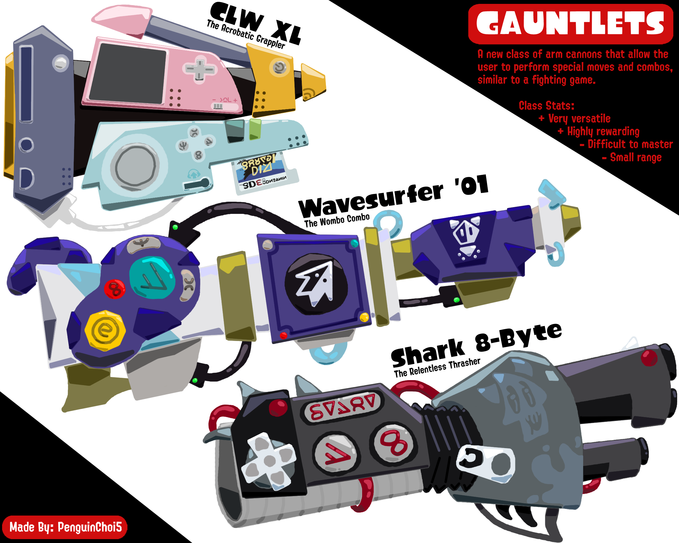
Last year, when I was in my Splatoon phase, I decided to craft more intriguing paint shooters for the game based on designs of old punk zines. I wanted to incorporate the brash and violent aspect of those zines into the design of a new instrument based on the Nintendo power glove. Originally, my paint shooter was going to be a subset of an existing instrument type called Dualies, but I decided later to upgrade them to a new type: Gauntlets. I’ve also made a few more members of the Gauntlet family, as seen below.

Gauntlets
After I crafted my Combo Dualies, I decided to rename them Shark 8-Byte (a pun based on the 8-bit nature of the glove as well as shark “bites”). Then, I decided to make them part of a new class of paint shooter, for my Combo Dualies were so different from normal dualies they felt out of place. My best option was to make it a brand new class by giving it friends. I based my Gauntlets on other game consoles–the GameCube and 3DS, to fit the nostalgic retro console theme of Splatoon itself. The end result is a nice sample platter of the class, with each Gauntlet being vastly different in design and personality.

Codfather Brush
My protective Codfather Brush, a play on a watchful and benevolent godfather and a nod to Splatoon’s ocean creatures, is my first attempt at making Splatoon paint shooters, and one of my first experiences with drawing on Photopea. I wanted to create a unique brush that deflects incoming ink attacks. I chose a brush because it was a class that wielded the least innovation. There were only two kinds–light and heavy. I eventually decided on a Chinese brush design inspired by a calligraphy pen. My design is based on curves. My pen features a black core covered in a scarlet ceramic red shell engraved with gold faux protective script in a cabalistic fictitious Asian language. This black, red, and gold color scheme also echoes Chinese New Year hues to lend the pen a celebratory air.

Boombarder
Out of all the designs I made for Splatoon, the Boombarder (based on this particular vintage boombox with an upgraded TV screen) is my personal favorite. It is one of my best executed drawings in terms of the shading, especially in its sheen and reflective steel frame. Although Splatoon relies on song idol wars and musical battles for its teen-punk identity, it offers only one musical tool when it comes to its vast ink flinging arsenal. So, as a homage to its 80s-90s era influences, I created a beatbox-inspired towering sledgehammer of thundering shockwaves to lightning clap one’s foes faster than the sound barrier itself. This piece of art is also where I invented my dynamic Squidmann, a little guidebook character based on the characters in IKEA instruction manuals and the simple characters in bathroom signs. I ended up using him again for numerous other Splatoon fan concepts in the future to explain my ideas, such as in my Swimsquid concept.

Eelectric Gladius
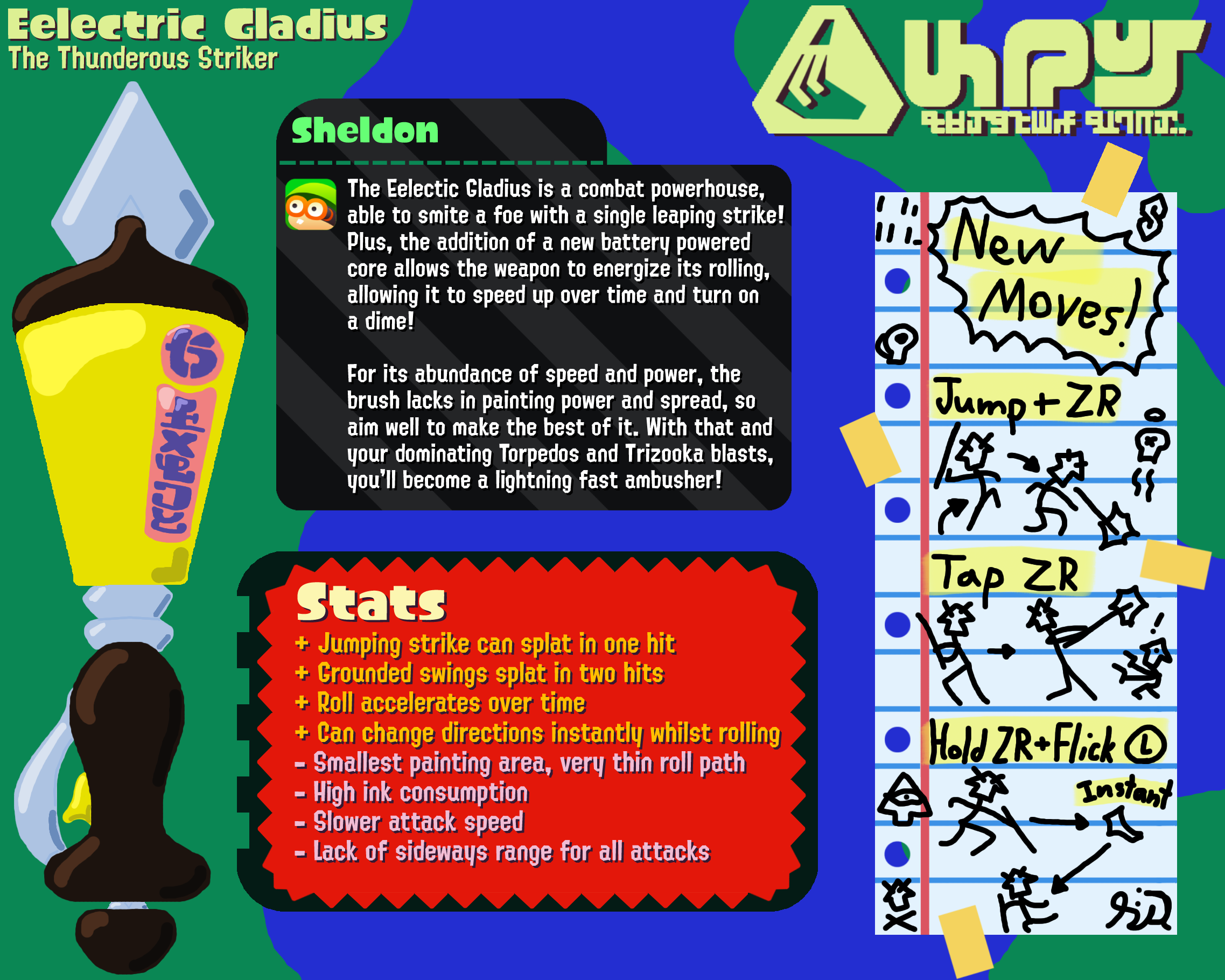
As Splatoon fans always clamor for more brushes, I designed my Eelectric Gladius to complement the Codfather, the latter of which my teacher suggested could use more shading. I’m glad I listened to my teacher’s feedback, as prioritizing shading in every project has elevated my art. The concept itself is a highlighter pen that strikes fast with bold yellow lines. This is also when I started paying attention to my background. When I was making Codfather, I was only concerned with shape and color. With Eelectric, I wanted to try to replicate the mood of Splatoon’s youthful style. So here you start to see me incorporate the game’s vibes into my art with a wobbly ink-like background, an assortment of tacky shopping tags to indicate my gladius’ features, and even a fun lined-page segment reminiscent of notes on school paper.

Fan Editorial For Newspaper
Here is my fictional newspaper clipping announcing my creating three new instrument classes for Splatoon (Gauntlets, Wands, and a planned class, “Revolvers”, based on a discarded concept from Splatoon’s first game) and its enthusiastic response. My clipping’s caramel and burnt orange aesthetic is based on Splatoon’s sepia newspaper as well as the bold “WAR!” headlines that burned across papers during WWII. There was a newspaper model in the 1st game that I took direct inspiration in replicating here, but the true test was graphic design and text placement. I wanted to create something simple and clean, but also very recognizable as a Splatoon concept, so I ended up using very simple brown colors to both replicate the original model’s hues and suggest the decrepit age of the paper used.

Genetico Eye Logo
When I googled “genetics logos” for inspiration, I found they were all the same–focusing on the human genome as a double helix. That felt very boring and derivative to me, so I wondered if it were possible to create a logo that felt connected to the same gene symbolism, but from a unique angle. I experimented with many concepts until I landed upon my bullseye. The dual color Genetico Eye represents cross-discipline innovation, and the burgeoning growth of mitosis represents Genetico’s large range of products.

Genetico Business Card
Genetico’s business card was directly inspired by Rudolph de Harak’s The Potential of Woman. I loved how her unique two-toned skin color made an illusory shadow creep along her face. As an homage to this idea, I designed an edgier, surreal version of Harak’s woman with a split throat and body to convey how one would split open a cadaver for scientific examination. I then added an orange-and-dull-pink-striped shroud to wrap the “mummy,” which connotes remaking the body for eternity as well as adding to the design’s asymmetry, which Harak’s lacked. I then added a variation of my “Genetico Eye” to this mummy to add an air of mystery to the figure. I think giving my mummy only one eye makes him seem as if he were just now awakening for the first time–peering through his first working camera eyehole to greet us.

Genetico Garden Brochure
For Genetico’s brochure, I wanted to craft it in the same abstract style, but somehow invoke a sense of wonder through simple colors and shapes. I decided upon the idea of a magical “garden” with Genetico’s wondrous, other-worldly genetically engineered fruits and nuts as well as a blue flower sprouting from a Genetico-eyed red teapot to suggest hospitality. As for Genetico’s Nouveau Cuisine, we begin with the spicy, herbal “Golden Rivet,” whose buttery, crispy frontal profile belies the fact that it cloaks a wasabi burn. Our “Blue Limo” is a new citrus that’s sweeter, savorier, and mellower than its cousins with a citrusy punch. “Triple Eye” is a tart, light melon that exudes a flowery ambrosia. Lastly, “Pearl Casket” is a melting cotton-candy treasure box of a luscious pink fruit that once opened, reveals dark molasses chewy balls.

Genetico Triangular Box
Genetico’s “RGB Skin GenePack” allows you to change your skin color via pill and body paint that allows you to customize its hue and intensity with your face and body as its canvas. The kit also includes paint-removal face masks. This product is brought to you by Genetico’s Chromatico beauty division, which features its own logo of an eye flowering into four colors. On the package’s top is a multi-colored striped face with an asymmetrically-placed Genetico eye and an eye as the bar code. I designed a triangular box not only because of its practical packing utility, but also because the triangle symbolizes dynamic motion; stability and power; and the union of body, mind and spirit. Since triangular boxes are unusual, I thought they would emphasize Genetico’s renegade uniqueness.

Genetico Presentation & Site
My Genetico PowerPoint and website homepage (I only crafted the homepage and not any of the other pages, as Genetico itself is just an exercise in my own graphic design training) are the final result of the slow iterative process of creating Genetico’s unique semi-creepy, retro-futuristic visual and aural identity. In these pages, I explain each of Genetico’s four divisions, from medical Therapeutico to Aromatico’s food and fragrances. I also expanded Genetico’s logo iterations and decided to put the Genetico Eye on everything, even shaping its barcode into an Eye to make people feel watched. I also decided upon a New Age, sketchy but cool linguistic style for Genetico’s copy.

Pig Genie
I wanted to create a Minecraft model for a new nether boss, but I didn’t want to create another fire inspired mob. So, I used the idea of piglins and their greed to make a genie with many hands. I like the concept of it as a multi-handed creature in general, as it makes it seem as if there are greedy snatching fingers scratching for treasure in every fold of the genie’s crimson robes. It is not only very thematic for the piglins as a whole (as a lot of their identity surrounds gold), but it also brings some more diversity to the nether.

Microphone
Out of all of the concept models I have created, this has the best shading out of all of them. I made this as part of an idea for a Create (a great minecraft mod) addon called Entertainment Enigmatics, based on the entertainment industry of Old Hollywood. A part of that was an idea for a microphone that could record any sound and engrave it upon a massive disk. This would expand the creativity of players massively, as they can use sound effects or even custom songs to truly ameliorate their creations.
